
Many teams struggle with the same problems: a small space that feels cramped instead of curated, storefronts that fail to stop foot traffic, product displays that bury the hero item, and a shopping experience that feels thrown together rather than intentional. Layout and display aren't separate decisions here. They're the same decision, made twice.
This guide walks through how to plan a pop-up's footprint, build customer flow that feels natural, and design displays that sell, without losing the brand's personality along the way.
Key Takeaways
- Anchor every layout decision to the pop-up's core goal, whether that's sales, launch buzz, sampling, or feedback collection.
- Build clear sightlines and one defined focal point so customers understand the space within seconds of walking in.
- Match fixtures, lighting, and product grouping to how customers actually shop that category.
- Choose modular, reusable fixtures if the pop-up will travel, rotate seasonally, or feed into a bigger rollout.
Start With the Pop-Up's Goal, Audience, and Footprint
A pop-up built to sell inventory fast looks nothing like one built to gather customer feedback or introduce a new product line. Before sketching a floor plan, define the job the space needs to do.
Match the layout to the format:
- Sales-focused shop: dense product display with fast checkout access
- Product launch: one hero moment and minimal competing displays
- Showroom: open sightlines, fewer SKUs, stronger storytelling
- Sampling activation: trial stations with staff close enough to guide
- Shop-in-shop: compact footprint that still reads as its own brand
- Customer research pop-up: layout that invites lingering and conversation
According to the pop-up retail literature from Toronto Metropolitan University, layout and display variables directly affect how well the space avoids congestion and encourages engagement. That means space allocation, merchandise grouping, and even where the register sits all trace back to your goal.
Define the Customer Action You Want
Every layout decision should push toward a specific behavior: stopping to look, trying a product, chatting with staff, or checking out. Map these actions before you place a single fixture. A demo-heavy activation, for instance, needs open floor space near staff. A quick-browse retail format needs a faster path from entry to register.
Assess the Venue's Physical Constraints
Square footage varies wildly in real pop-up examples. ICSC documented an 80-square-foot Melrose, Massachusetts pop-up that rotated 11 brands through in seven weeks, while a Dennis' 7 Dees pop-up at Bridgeport Village ran closer to 3,000 square feet.
There's no universal "right" size—only the right size for your goal.
Before signing a lease, check:
- Total square footage and ceiling height
- Entrances, windows, and structural columns
- Power access and loading/unloading routes
- Storage limitations for backstock
- Landlord or venue rules on fixtures, signage, and drilling
CUBIC's installation guidance is clear: mount only on structurally sound walls, ceilings, and floors, and run a safety check before anyone drills. That step protects both the display and the venue.
Zone Before You Design
A simple zoning plan keeps customer-facing and operational areas from colliding. At minimum, separate:
- Product presentation
- Interaction or demo space
- Checkout or lead capture
- Staff positioning
- Backstock and packaging
A conceptual design package CUBIC built for a Dallas retail concept shows the same discipline. The plan treated the sales floor, fitting rooms, accessories, concierge, boutique, checkout, and support areas as distinct zones—not extras bolted onto the floor later.
Test the plan before installation day. Tape marks on a warehouse floor, cardboard mock-ups, or a digital rendering can reveal clearance problems, blocked sightlines, or awkward staff movement long before it costs you rent days to fix.

Build a Layout That Guides Customers Naturally
The first few feet inside the door matter more than almost anywhere else in the shop. Industry guidance from Storefront recommends keeping this "decompression zone" visually open so customers can orient themselves before committing to a direction. Cram a display into that space and people bounce right off it.
Choose the Right Circulation Pattern
Different layouts suit different assortments:
| Layout Type | Best For |
|---|---|
| Free-flow | Small, curated assortments; browsing-heavy shops |
| Guided-path | Storytelling brands, sequential product reveals |
| Grid | Dense inventory, fast-shopping formats |
| Perimeter | Small footprints needing open center space |
| Island | Statement products, demo stations |
| Shop-in-shop | Brands operating inside a host retailer |
A racetrack-style loop, with the register positioned near the exit, is a proven pop-up approach because it moves shoppers past more merchandise without forcing them to backtrack.
Avoid the Layout Mistakes That Kill Flow
Watch for:
- Dead ends that force customers to retrace their steps
- Narrow pinch points where two shoppers can't pass comfortably
- Blocked sightlines that hide the checkout or hero display
- Displays placed too close to the entrance, creating a bottleneck
CUBIC's TraxV system shows one practical fix: in a Jaxen Grey installation, the fixture stayed open enough to preserve sightlines toward seating and additional merchandise, instead of boxing the view in with a solid wall of product.
Place One Focal Point, Not Five
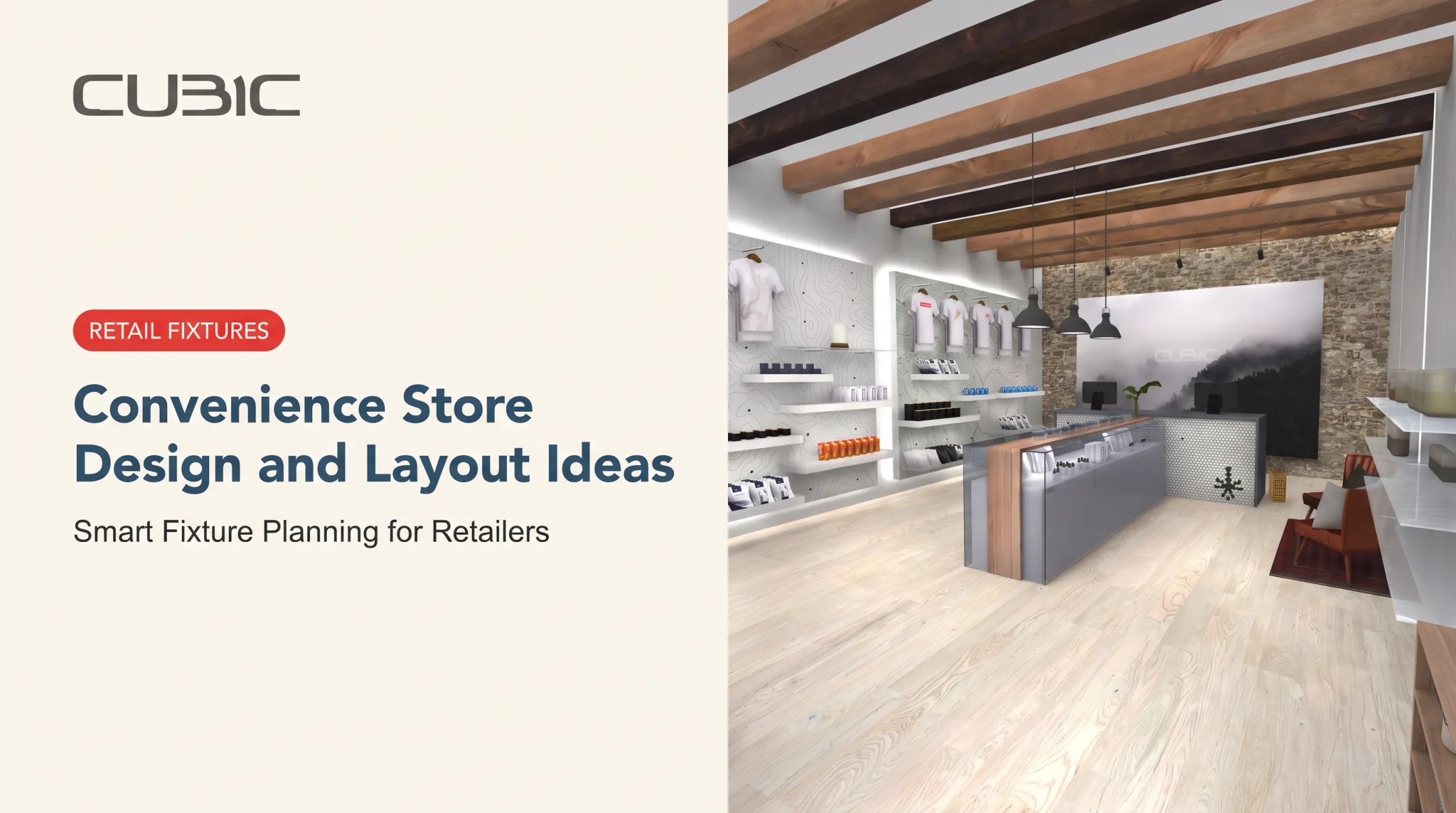
Pick a single hero display, a limited-edition product, or a demo station, and put it where the sightline is strongest. A large circular merchandising island works this way in a lifestyle and spa concept CUBIC designed, sitting centered in the room with perimeter shelving playing a supporting role rather than competing for attention.
Don't Skip Accessibility
ADA standards apply to temporary retail spaces, not just permanent ones. Section 201.3 explicitly includes temporary exhibit areas and facilities under its requirements. Practical minimums to build into your floor plan:
- 36 inches minimum clear width on accessible routes (32 inches allowed for short segments)
- 60-by-60-inch passing spaces if the main path is under 60 inches wide, spaced no more than 200 feet apart
- At least one accessible checkout aisle for selling floors under 5,000 square feet

These rules also improve everyday traffic. A path too narrow for a wheelchair is usually too narrow for a stroller, a shopping bag, or two people passing.
Design Displays That Make Products Easy to Notice and Shop
Not every product deserves equal visual weight. A clear display hierarchy tells customers where to look first:
- Brand or category introduction
- Featured products (the hero pieces)
- Supporting assortment
- Product information
- Purchase or next-step prompt Skip this sequence and everything competes for attention at once, which usually means nothing wins.
Match the Fixture to the Product
Different merchandise categories need different fixture formats:
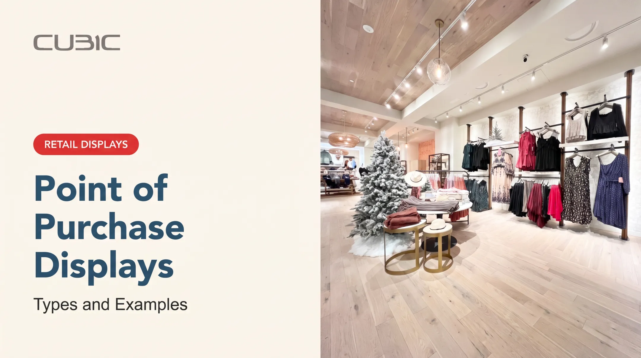
- Apparel: wall hanging systems and racks for folded and hung pieces side by side
- Home goods: open shelving and risers that show depth and texture
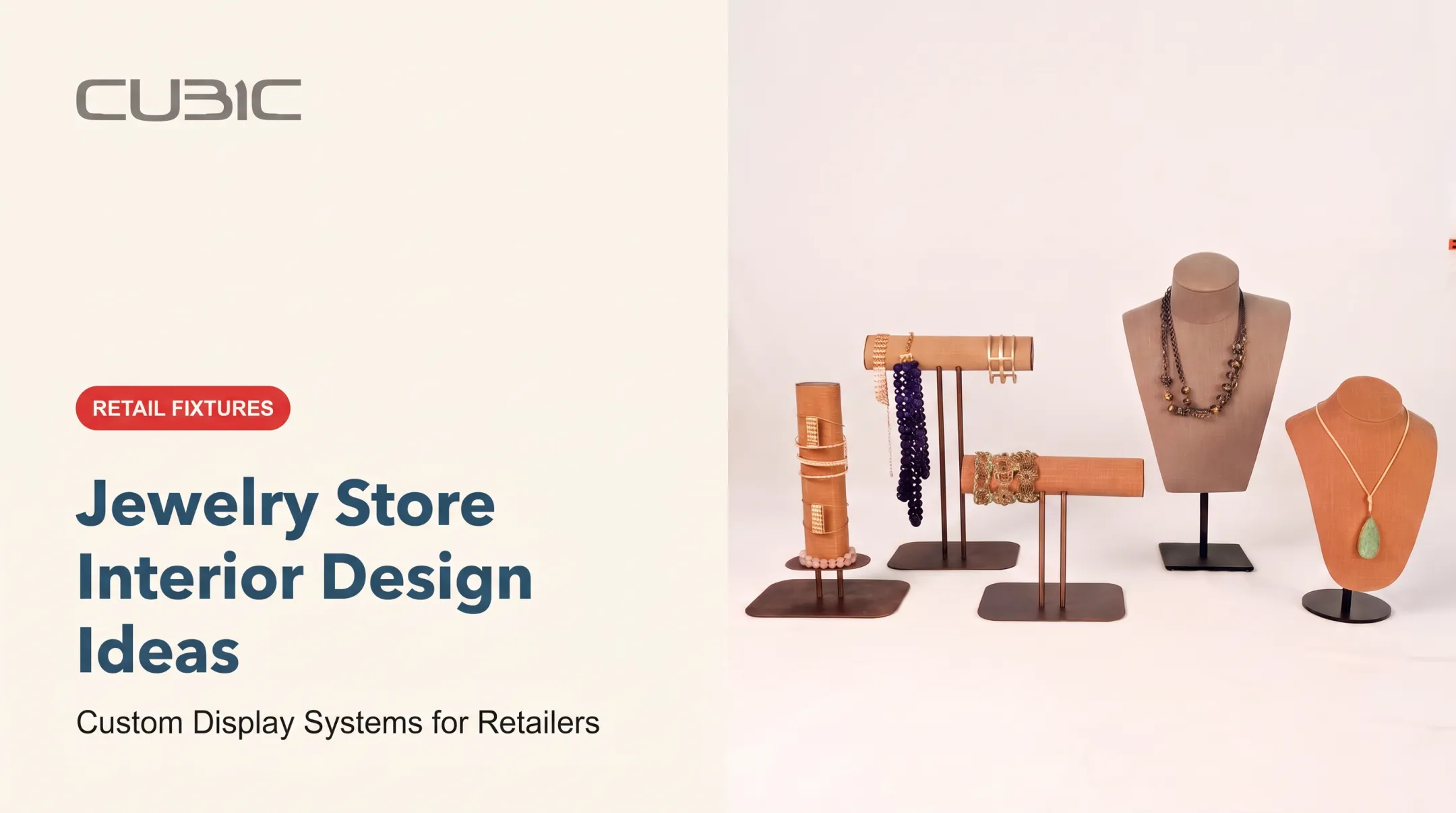
- Jewelry and watches: fine-scale casework, arms, busts, and spinners for small high-value items
- Beauty: tiered presentation that keeps bottles and packaging legible
- Changing assortments: modular shelving that reconfigures as inventory turns over CUBIC's SUSPEND line pairs vertical shelving rails with a hang-rod for apparel, while the TABLETOP line covers jewelry arms, busts, and spinners.
Use Height and Spacing to Create Rhythm
Eye-level placement, negative space, and grouped collections all help customers process a display faster. A Jaxen Grey freestanding fixture shows the idea in practice: multi-tier wood-and-metal shelving and integrated LED lighting. Varied elevations hold folded apparel, caps, and accessories without visual clutter. Lighting and signage should answer questions, not add noise. Accent lighting reveals texture and quality; task lighting supports fitting rooms or counters. Signage should state price, material, or use case at a glance so shoppers do not hunt for basics.
Build In Flexibility From the Start
Hierarchy and the right fixtures only hold up if the display can change with the run. Pop-ups shift mid-event more often than permanent stores—new arrivals land, limited releases sell out, and multi-city tours must strike and rebuild the same setup. Design for that reality with:
- Interchangeable graphics
- Adjustable shelves
- Movable racks
- Reconfigurable accessories
- Planned refresh points during the activation This is where modular fixture systems earn their keep. CUBIC's TraxV system, for example, lets shelving, face-outs, and hang-rails move on the same track when a promotion or seasonal assortment shifts—without tearing down the whole display. CUBIC used a similar approach for Marriott with six interchangeable display bays that reconfigured across property needs. For operators moving between venues or multiple event dates, that flexibility—and a path from sketch to manufacturable fixture—shortens the gap between the idea and what ships on time.

Add Branding and Experience Without Sacrificing Function
A pop-up can experiment more than a flagship store, but it still needs to look like it belongs to the brand. Keep color, typography, logo placement, and materials consistent with the broader brand identity, even while the format itself gets playful.
Choose Experiences With a Purpose
Interactive elements only work if they support the product or goal. At LATHER's Long Beach location, customers could sample products and mix their own natural-oil scents—an experience tied directly to the product, not a decoration bolted on for novelty.
Research on luxury pop-ups points the same way. A study of 345 visitors to matched US and UK pop-up stores found that store atmosphere and uniqueness increased word-of-mouth intentions. Brand experience was the link between the environment and what shoppers told others later.
Options worth considering:
- Personalization stations
- Live demonstrations
- Sampling bars
- Short workshops
- Designed photo moments
Connect the Visit to What Happens Next
The best pop-ups don't end when the customer walks out. Build in a clear next step:
- QR codes linking to product details or online ordering
- Email or SMS sign-up (positioned so it doesn't create a queue)
- Social sharing prompts tied to a specific visual moment
- Appointment booking for high-touch categories
One well-known example: a Toronto holiday pop-up let shoppers scan an item's QR code and have it shipped straight home instead of carrying it. Whatever mechanism you choose, keep it out of the main walking path. A sign-up table blocking the entrance defeats its own purpose.
Frequently Asked Questions
How much space does a pop-up shop actually need?
There's no fixed minimum. Documented examples range from 80 square feet to 3,000 square feet, depending on the format and goal. Size the space to your product assortment and customer action, not a generic benchmark.
What's the biggest layout mistake pop-up shops make?
Blocking the entrance area with displays. Customers need a few open feet to orient themselves before they can process signage or merchandise.
Do ADA accessibility rules apply to temporary pop-up shops?
Yes. ADA standards explicitly cover temporary exhibit areas and facilities, including minimum path widths and accessible checkout counters.
Should I use rented or owned fixtures for a pop-up?
If the pop-up will move locations, run seasonally, or feed into a larger rollout, modular and reusable fixtures typically make more financial sense than one-time builds.
How do I keep a pop-up on-brand while still feeling experimental?
Keep consistent colors, typography, and logo usage as fixed points, then experiment with layout, materials, and interactive elements around them.